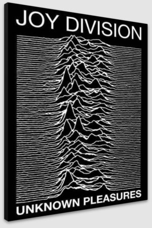
Joy Division’s iconic debut album cover features a strange white-on-black pattern. The iconic cover of Joy Division’s 1979 debut album Unknown Pleasures is perhaps the most enduring image of the post-punk era. The stark white-on-black line drawing conjures up so much mystery. Back in the pre-internet days, information about Joy Division was sparse: the band’s names did not appear on the record and there was no way any photos of the musicians would appear on a sleeve. An air of mystery grew up around the Unknown Pleasures cover. What did the enigmatic waveform symbolise? Was it a heartbeat? Was it a mathematical analysis of something sinister? Was it the cosmic scream of a dying star? Or was it just the sound wave of those terrifying syn-drums that swamp the Joy Div track Insight?
Answer: none of the above. Although one suggestion was close.
In simple terms, the image is a “stacked plot” of the radio emissions given out by a pulsar, a “rotating neutron star”.
Originally named CP 1919, the pulsar was discovered in November 1967 by student Jocelyn Bell Burnell and her supervisor Antony Hewish at Cambridge University. As the star turns, it emits electromagnetic radiation in a beam like a lighthouse, which can be picked up by radio telescopes. Each line on the image is an individual pulse. They’re not exactly the same each time as they’re travelling a long way across the universe and interference gets in the way. As Jen Christiansen of Scientific American discovered in an exhaustive feature, the image was originally published as white on a bright blue background.
But the magazine had actually reproduced the academic work of a graduate student, Harold D. Craft Jr, who had published his PhD thesis in 1970 called “Radio Observations of the Pulse Profiles and Dispersion Measures of Twelve Pulsars”. Working at the Arecibo Radio Observatory in Puerto Rico, Craft used new computer technology to plot the radio waves of CP 1919. He told Christiansen: “I wrote a program that, instead of having [each line] lined up vertically, I tilted them off at a slight angle so that it would look like you were looking up a hillside – which was aesthetically pleasing.” Writing up his thesis, Craft handed the plots over to a female draftsperson at Cornell University, who filled the lines in with black ink.
But how did this piece of head-scratching astronomy end up on the cover of a debut album by a Manchester post-punk indie band?
The image was reproduced in the UK in 1977 as part of a big book called The Cambridge Encyclopaedia of Astronomy, where it formed part of a feature on pulsars… which were, of course, discovered by Cambridge researchers. It was here that Bernard Sumner – himself a graphic designer working at the Cosgrove Hall animation studios in Chorlton, Manchester – saw the image. He told Maxim in 2015: “On my lunch break, I’d go to the Manchester Central Library, and get a sandwich at the cafe. They had a good art section and a good science section. I’d read through the books in search of inspiration. One of the images I found was the Unknown Pleasures image that clicked with me straight away. In Joy Division, I had insomnia and stayed up very late. I was building synthesisers – they took months to build, soldering all the components, and I’d have 2001: A Space Odyssey playing in the background. If you take the obelisk out of that movie, it has that same black shape.”
When Joy Division were looking to release their debut album with Tony Wilson’s Factory Records in the summer of 1979, they went to the label’s in-house designer Peter Saville to discuss the cover. He told MOJO in 2005 that the band approached him with a file of cuttings and offered up the plot of CP 1919’s radio waves and another enigmatic image of a hand emerging from behind a shadowy door, which was taken from a 1970 book of photos by Ralph Gibson called The Somnambulist. Saville recalled: “[They said] we’d like it to be white on the outside and black on the inside. I took these elements away and put it together to the best of my ability. No one said what size or where – I had to figure out how. SOURCE“I contradicted the band’s instructions and made it black on the outside and white on the inside, which I felt had more presence.”


Reviews
There are no reviews yet.